
A status changer layout is a per-target button arrangement for the status-changer widget on terminals, in the Voxbi app, and on the web. Each layout maps a set of statuses to buttons so different devices and departments see only the statuses relevant to them.
Overview
Layouts decouple what statuses exist (managed on the statuses page) from what a given device shows.
What it does
When someone opens the status changer, the client reports its source (terminal, app, or web) and its target (the employee or terminal). The system picks the most specific layout matching both, and falls back to the default when nothing matches.
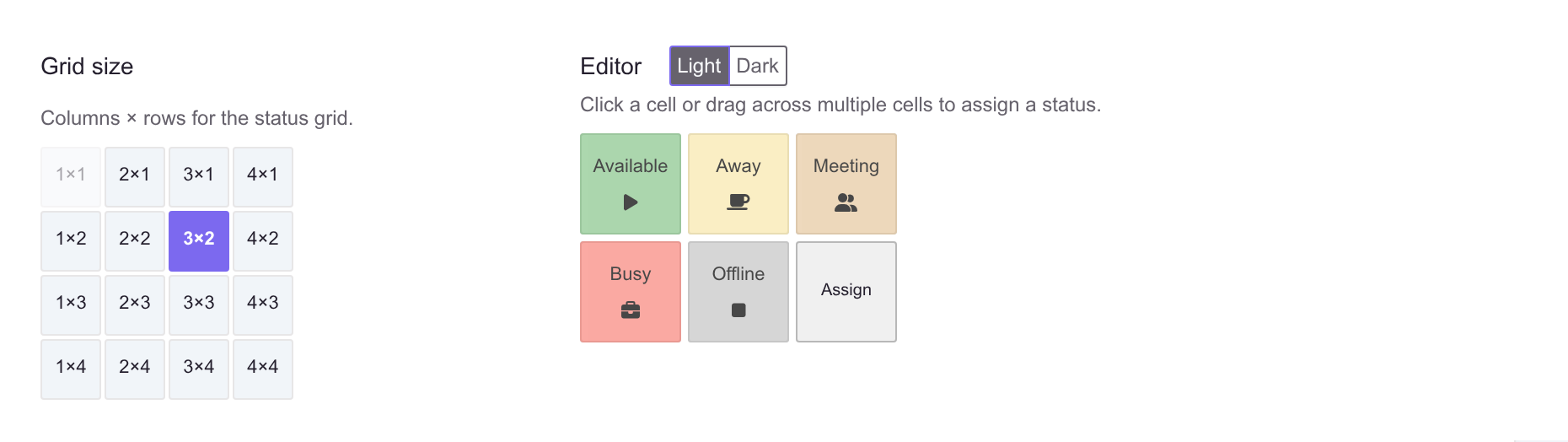
The grid size sets how many columns and rows of buttons the target sees, and the editor beside it is what the employee will actually be looking at.
See also
- Statuses - the buttons a layout arranges.
- Terminals - the hardware that uses layouts.
- Tempus schedules - a related concept that also restricts statuses.